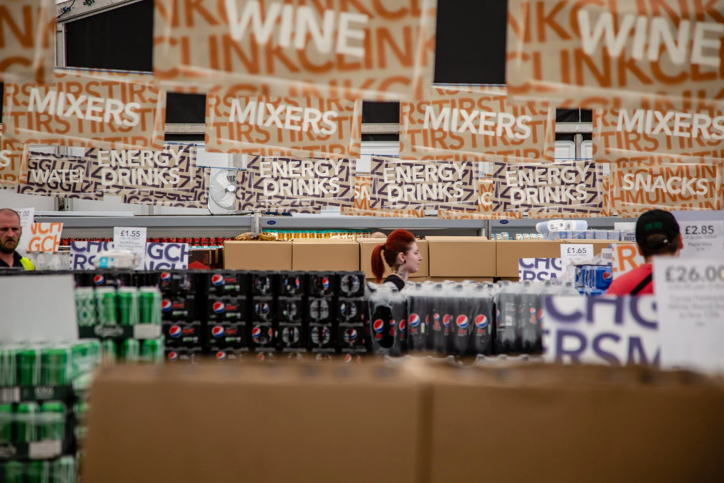
Co-op was popping up at four festivals across the UK and tasked ROAR Creativity with designing and producing the internal, external and directional signage. Co-op wanted to keep their iconic look and feel, but at the same time incorporating the festival spirit. We came up with two designs; a mash-up of each festival and the Co-op logo, and also typography design.
The main challenges were to transform a pretty corporative typeface as Avenir into something cool and more interesting and mix 2 brands together working in harmony.


